
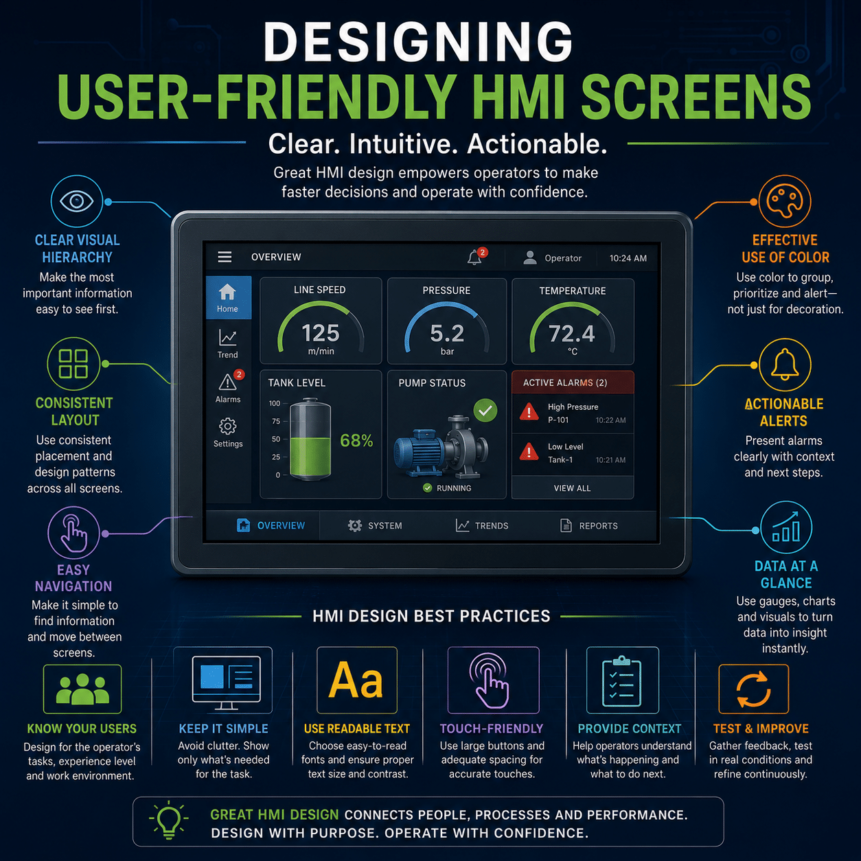
Human-Machine Interfaces (HMIs) serve as the bridge between operators and industrial equipment. Whether controlling a manufacturing line, monitoring a water treatment facility, or managing an HVAC system, the effectiveness of an HMI can significantly impact productivity, safety, and operational efficiency.
Unfortunately, not all HMI screens are designed with the operator in mind. Overly complex layouts, excessive colors, and poorly organized information can lead to confusion, slower response times, and increased risk of operator error.
Effective HMI design focuses on clarity, usability, and situational awareness. By following proven design principles for layout, color usage, and workflow organization, engineers and system integrators can create interfaces that help operators make faster, more informed decisions.
Why HMI Design Matters
An HMI is much more than a graphical representation of equipment. It is a decision-making tool.
Operators use HMIs to:
- Monitor system performance
- Identify alarms and abnormal conditions
- Adjust process parameters
- Start and stop equipment
- Analyze trends and historical data
- Respond to system events
When information is presented clearly, operators can quickly understand system status and take appropriate action. Poorly designed interfaces can have the opposite effect, increasing workload and delaying responses during critical situations.
In industries where downtime, safety incidents, or product quality issues carry significant consequences, effective HMI design becomes a valuable operational asset.
Start with the Operator’s Workflow
One of the most common HMI design mistakes is building screens around the equipment instead of the operator.
Engineers often organize screens based on how systems are wired or programmed. Operators, however, think in terms of tasks and processes.
Before designing any screen, ask:
- What information does the operator need most frequently?
- What actions must be performed regularly?
- What decisions need to be made quickly?
- What problems occur most often?
The answers should guide the structure of the interface.
A well-designed HMI supports the natural workflow of the operator rather than forcing operators to search through multiple screens to find critical information.
Design Around a Clear Screen Hierarchy
Modern HMI design often follows a hierarchical structure that allows users to move from high-level system visibility to detailed diagnostics.
Level 1: System Overview
The primary screen should provide a high-level overview of the entire process.
This screen should answer questions such as:
- Is the system operating normally?
- Where are problems occurring?
- What equipment is running?
- Are there active alarms?
The overview screen serves as the operator’s dashboard and should be accessible at all times.
Level 2: Area or Process Screens
These screens provide more detailed information about specific process areas, machines, or production lines.
Examples include:
- Pump stations
- Packaging equipment
- Conveyor systems
- HVAC zones
Level 3: Equipment Detail Screens
These screens display detailed operating information for individual assets.
Examples include:
- Motor status
- Drive parameters
- Sensor readings
- Maintenance data
Level 4: Diagnostic and Configuration Screens
The most detailed screens should be reserved for troubleshooting and engineering functions.
This layered approach helps prevent information overload while allowing operators to drill down when necessary.
Keep Screen Layouts Clean and Organized
A cluttered screen increases cognitive load and makes it more difficult for operators to identify important information.
Effective layouts typically include:
Consistent Navigation
Navigation buttons should remain in the same location throughout the application.
Common placements include:
- Top navigation bars
- Left-side menu panels
- Fixed footer controls
Consistency helps operators build familiarity and reduces training requirements.
Logical Grouping
Related information should be grouped together.
For example:
- Pump controls next to pump status indicators
- Temperature values grouped with temperature alarms
- Production metrics displayed in a common dashboard section
Grouping information reduces the amount of visual searching required.
Adequate White Space
White space is not wasted space.
Strategic spacing improves readability and helps separate different functional areas of the screen.
Crowded interfaces often appear more complex than they actually are.
Use Color Purposefully
One of the biggest mistakes in HMI design is using too many colors.
Many older systems display equipment in bright reds, greens, blues, yellows, and purples simultaneously, creating a visually overwhelming experience.
Modern high-performance HMI design takes a different approach.
Use Neutral Colors for Normal Conditions
Normal operating equipment should typically appear in neutral tones such as:
- Gray
- White
- Soft blue
- Muted earth tones
When everything is colorful, nothing stands out.
Reserve Bright Colors for Abnormal Conditions
Color should attract attention only when necessary.
Common conventions include:
|
Color |
Typical Meaning |
|
Red |
Critical alarm or fault |
|
Yellow/Amber |
Warning or abnormal condition |
|
Green |
Running or active status |
|
Blue |
Operator action required |
|
Gray |
Inactive or unavailable |
By minimizing color use during normal operation, alarms become immediately noticeable.
Prioritize Situational Awareness
The primary purpose of an HMI is helping operators understand what is happening right now.
Good situational awareness means operators can quickly answer:
- What is happening?
- Why is it happening?
- What needs attention?
- What action should be taken?
To support situational awareness:
Display Key Performance Indicators (KPIs)
Important metrics should be visible without navigating through multiple screens.
Examples include:
- Production rate
- Energy consumption
- Flow rate
- Temperature
- Pressure
- Equipment utilization
Highlight Trends
Operators often gain more insight from trends than from individual values.
Trend displays help identify:
- Gradual performance degradation
- Process instability
- Equipment wear
- Developing faults
Historical context supports better decision-making.
Simplify Alarm Management
Poor alarm design can overwhelm operators during abnormal events.
Best practices include:
Prioritize Alarms
Not every event should be treated as critical.
Classify alarms according to severity:
- Critical
- High
- Medium
- Informational
Avoid Alarm Flooding
Excessive alarm notifications can cause operators to ignore important alerts.
Alarm rationalization helps ensure only meaningful events trigger notifications.
Provide Context
An alarm should explain:
- What happened
- Where it occurred
- Possible causes
- Recommended actions
The goal is to help operators respond, not simply notify them.
Optimize for Touchscreen Operation
As touchscreen HMIs become increasingly common, interfaces should be designed accordingly.
Use Larger Touch Targets
Buttons should be large enough for accurate operation while wearing gloves if required.
Avoid Overcrowding Controls
Closely spaced buttons increase the risk of accidental selections.
Limit Excessive Data Entry
Whenever possible:
- Use dropdown menus
- Provide preset selections
- Minimize keyboard input
Reducing manual entry speeds operation and reduces errors.
Standardize Graphics and Symbols
Consistency improves usability.
Operators should not need to interpret different symbols for identical equipment across screens.
Standardize:
- Pumps
- Valves
- Motors
- Sensors
- Conveyors
- Drives
Consistent graphics reduce training time and improve operator confidence.
Test with Real Operators
One of the most valuable steps in HMI development occurs before deployment.
Involve actual operators during design reviews.
Ask them:
- Is information easy to find?
- Are controls intuitive?
- What screens are used most frequently?
- What would improve response times?
Operators often identify usability issues that engineers may overlook.
Testing early can prevent costly redesigns later.
Common HMI Design Mistakes
Avoid these frequently encountered issues:
- Excessive use of bright colors
- Overcrowded screens
- Inconsistent navigation
- Too many alarms
- Small touchscreen controls
- Excessive animations
- Complex menu structures
- Lack of trend data
- Poorly organized information
- Screens designed around hardware rather than operator tasks
Eliminating these problems often leads to immediate improvements in usability.
Final Thoughts
A well-designed HMI does more than display information—it helps operators understand processes, identify problems, and make informed decisions quickly. Effective HMI design combines clean layouts, thoughtful color usage, logical workflows, and clear navigation to create an interface that supports both productivity and safety.
By focusing on operator needs, minimizing visual clutter, and emphasizing situational awareness, organizations can build HMIs that improve efficiency, reduce errors, shorten training time, and enhance overall system performance.
In today’s increasingly automated facilities, user-friendly HMI design is not simply a convenience—it is an essential component of successful industrial operations.